
Link Light Rail – Brand Redesign
Redesigning the brand of Link Light Rail to reflect its diverse ridership as service expands into the greater Puget Sound area.
My Roles
Project Design
Visual Design
Art Direction
Timeline
January – March 2023
Adobe Illustrator
Adobe Photoshop
Adobe Indesign
Figma
Tools
Team
How do we redesign Link’s branding to better reflect its growing service area and clientele?
A Link Light Rail train car with its current branding
The Challenge
How does Link Light Rail reflect its role in the community?
Link Light Rail’s current branding lacks a strong, engaging brand presence beyond association with its core service. The light rail service is not easily identifiable as a separate entity vs Sound Transit as a whole. This “brand weakness” bleeds into Link’s informational graphics and brand material, lowering brand cohesion, clarity of information, and ultimately detracts from the level of service provided to its customers
The Solution
Redesign Link’s branding to separate its unique services from the rest of Sound Transit
A differentiated, cohesive rebranding will provide a clearer pathway for informational graphics and way-finding, will do a better job of explaining company goals and mission to customers, and will allow for greater brand extension through other customer facing avenues (such as merchandising).
How we determined our design process
BRAND DISCOVERY
Compiling images and descriptors related to Link’s brand characteristics allowed us to focus in on the core brand identifiers we would use to guide our redesign.
From our initial discovery work, we honed in on the three pillars of “Community-Focused,”
“Service-Oriented,” and “Forward-Thinking” around which we would build our design strategy.
CONCEPT BOARD
These three pillars guided our creation of a brand Concept Board that would guide our development of individual marketing assets.
Brand Assets
Logo
Initial logo sketches
Our logo redesign highlights motion, a focus on forward-thinking, and winks at the visual of a seated rider on a train.
Stations & Wayfinding
Repeating patterns of modular shapes serve as way-finding aids as well as enhancing visual interest. These patterns are repeated in other brand assets helping strength brand unity.
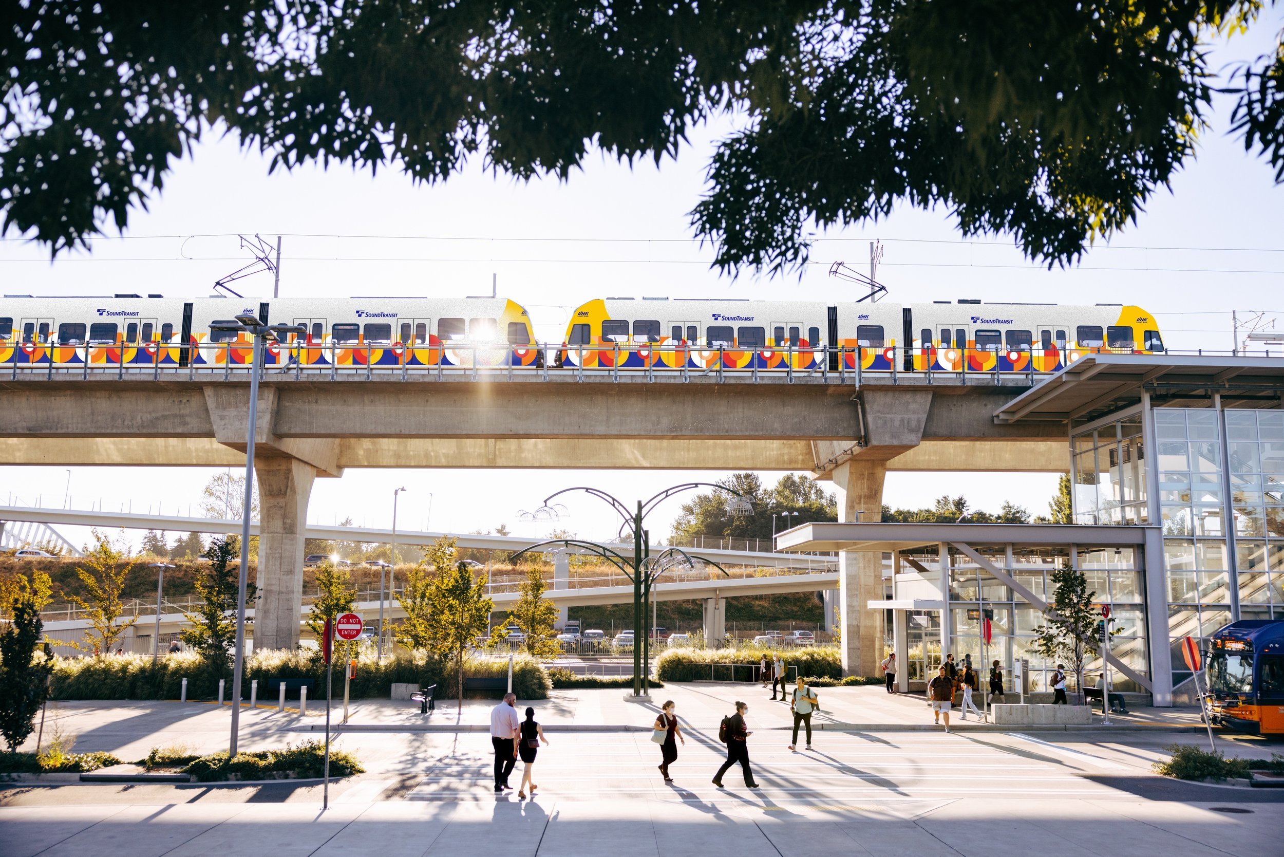
Train Wrap
The updated train wrap maintains unity with previous Sound Transit branding while displaying Link’s separate identity. The pattern links with other environmental displays building brand unity and act as a safety device, ensuring the train is easily seen by passengers.
Website & Newsletter
Website
Email Newsletter
Environmental design patterns reappear within Link’s website and email newsletter templates ensuring brand unity.
Social Media
Example Instagram Post template for a “Sync with Link” Informational Event
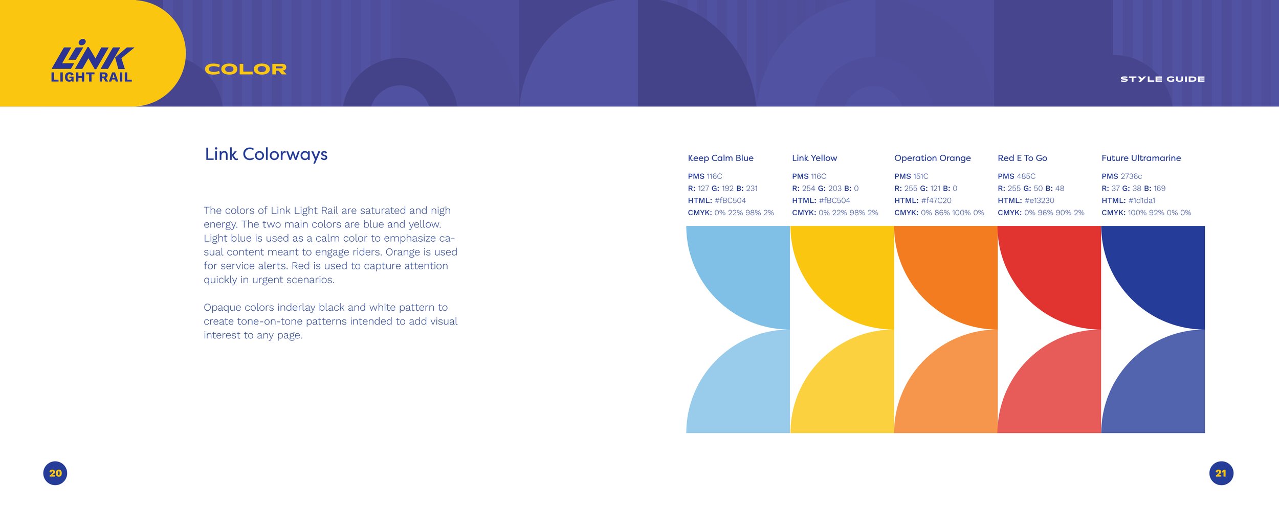
Visual Identity Guidelines
We created a full branding style guide to ensure that anyone using the updated Link Light Rail branding would be able to implement its style in a consistent and coherent manner. Below are a selection of pages from our style guide including guidelines for colors, typography, and logo usage.


Lessons Learned
Some of our greatest struggles in this project arose from design elements that we loved but just could not figure out how to work into the brand design.
We were able to progress more quickly and smoothly when we allowed ourselves to abandon design ideas that we loved, but just were not working.
Learn how to let go!
A complex system of multi-referential icons and color schemes may seem like a great idea from behind the scenes, but often our “best” ideas were not easily communicated to our audience.
The concepts that worked the best turned out to be those that were often (but not always) the more simple to implement, as they required less explanation to our users and clients.
Keep it simple
No idea is inherently good or bad without context. Some of our branding ideas that our team found less exciting actually were the most successful when tested on potential users/clients.
Trusting your own design is important, but we also found it very helpful to incorporate user feedback often in our design process.