

Penny App – Financial Management & Education
Increasing accessibility to financial education and asset management
My Roles
UX/UI Design
User Testing
Research
Timeline
April – May 2023
Tools
Figma
Team
The Challenge
Many young adults lack an accessible introduction to personal finance.
Education around personal finance is largely unstructured and varied. It can come from parents, friends, social apps, or be almost non-existent depending upon the person involved. Much of the information around finance also involves complex terminology that does not sync with the everyday experiences of young adults just beginning their financial journeys.
The Solution
A chat-based finance app that lowers the hurdles of financial education.
The Penny app provides financial management tools alongside educational tutorials and an always-present chat-bot ready to answer any questions a user might have. Finance related questions can be answered quickly and easily and then this knowledge can be directly applied to a user's own funds.
Users want easy to understand information and help with basic finance-related tasks
“I want a breakdown of financial terms in plain-speak and help investing my money in a way that doesn't require much of my time or attention”
– User Survey Feedback
After gathering our research we planed an object-oriented organizational site architecture aka “What are we actually putting in this app?”
Our Object-Oriented model of app information content and hierarchy
Based off of our user research we developed “personas” for which we created task flows solving individualized financial issues
Distinct personas allowed me to separate our app functions to meet specific requirements, and help keep focus on user’s needs and pain points
I then began the process of translating user flows into initial screen sketches and early prototypes in Figma
Initial screen sketch
Mid-fidelity Mock-up
However, when my team met to combine our individual task flows, we realized it looked like we had each built a separate app. Even with the same starting materials, our screens looked nothing alike!
Messy beginnings of our design system
We quickly recognized the utility of a design system and shared set of components, naming conventions, and design tokens.
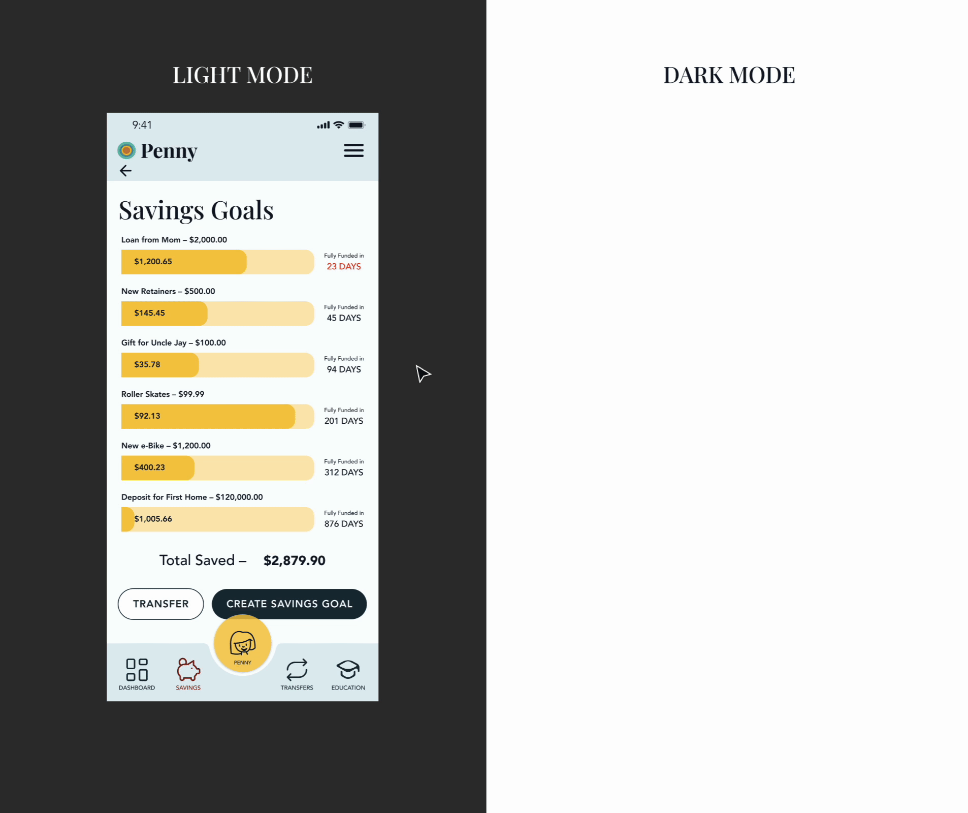
The implementation of design tokens also allowed me to easily generate light and dark modes
Rounds of user testing allowed us to determine how best to simplify our design. Focusing on the most pertinent needs of our users and clarifying complex language
Screen examples from the final prototype
Lessons Learned
Lack of job clarity early on in our project led to confusion, repeated work, and inconsistent design.
Once we determined more specific job roles, we were able to work faster and with much more clarity.
Define team roles early in the design process
A great color scheme means nothing if the color pairings mean type is illegible.
We were forced to swap out our initial design for one that better matched web accessibility guidelines. A hassle which we could have avoided had we considered those needs at the start.
Accessibility comes first
When no-one on the team is certain of a decision, the ultimate truth comes from your design documentation.
Ensuring that decisions are written down and explained makes future design decisions much more efficient.
Documentation leads decision-making
Next Steps
To further enhance the design of Penny, I would perform another round of user testing involving less structured use of the app.
Our task flows provided users with fairly clear “problems to be solved“ and I would be interested in seeing how users might interact with the app in a more self-led situation in order to see their patterns of content discovery.